Shuffle
Year: 2017
Client: Complex Networks
Scope: Product Design
Shuffle delivers a Snapchat-like, mobile-first video experience to the web. It provides storytelling capability with a reimagined interface for video consumption.
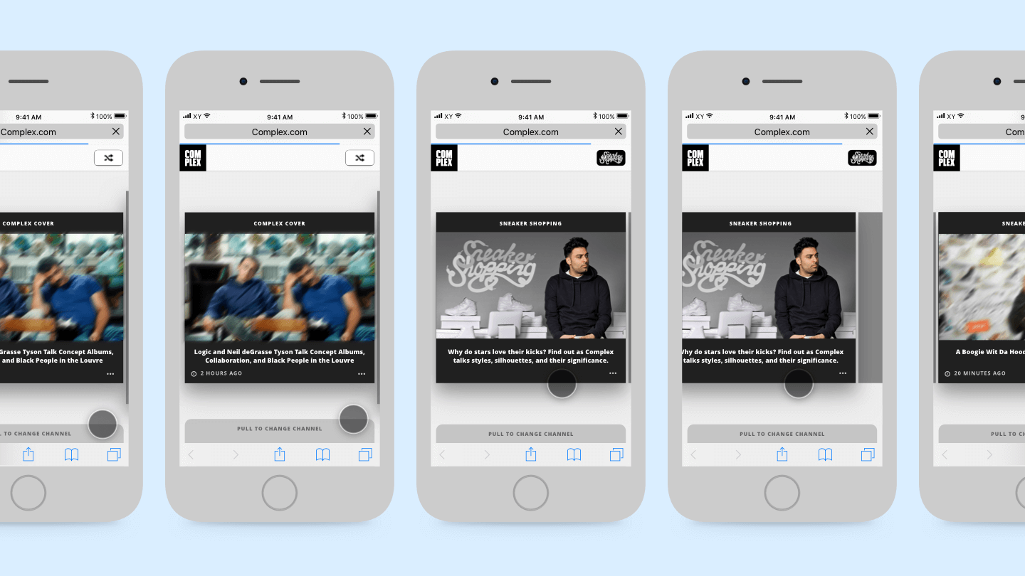
One of our goals was to supply an archive of over 40 web shows that could be easily navigated with one hand. People can swipe between videos and change channels using one thumb.
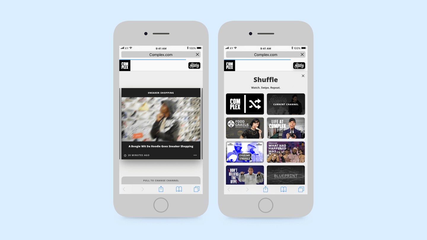
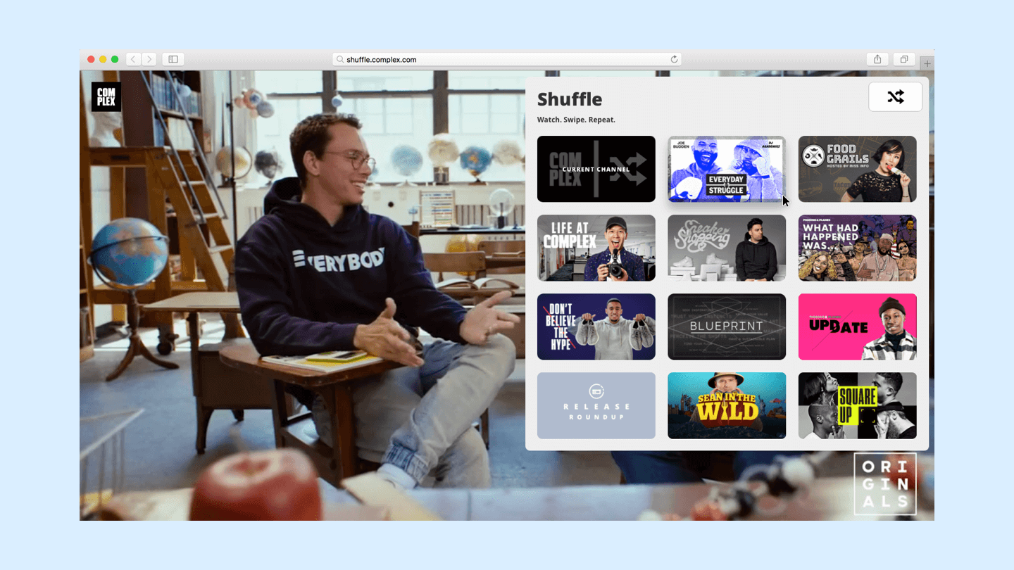
We provided a grid view of shows to offer easy navigation when we scaled our archive to contain over 40 shows.
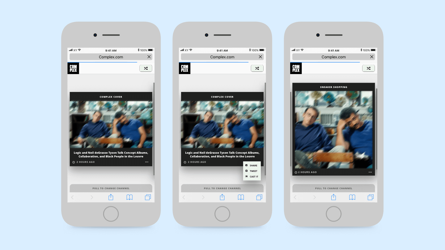
We were required to support 16:9 and 1:1 aspect ratios because the app would contain both long form video shows and social videos.
Responsive
Even though this product was built mobile-first, it was extremely important that the desktop view be equally beautiful. Thus, we provided a full-screen video experience.
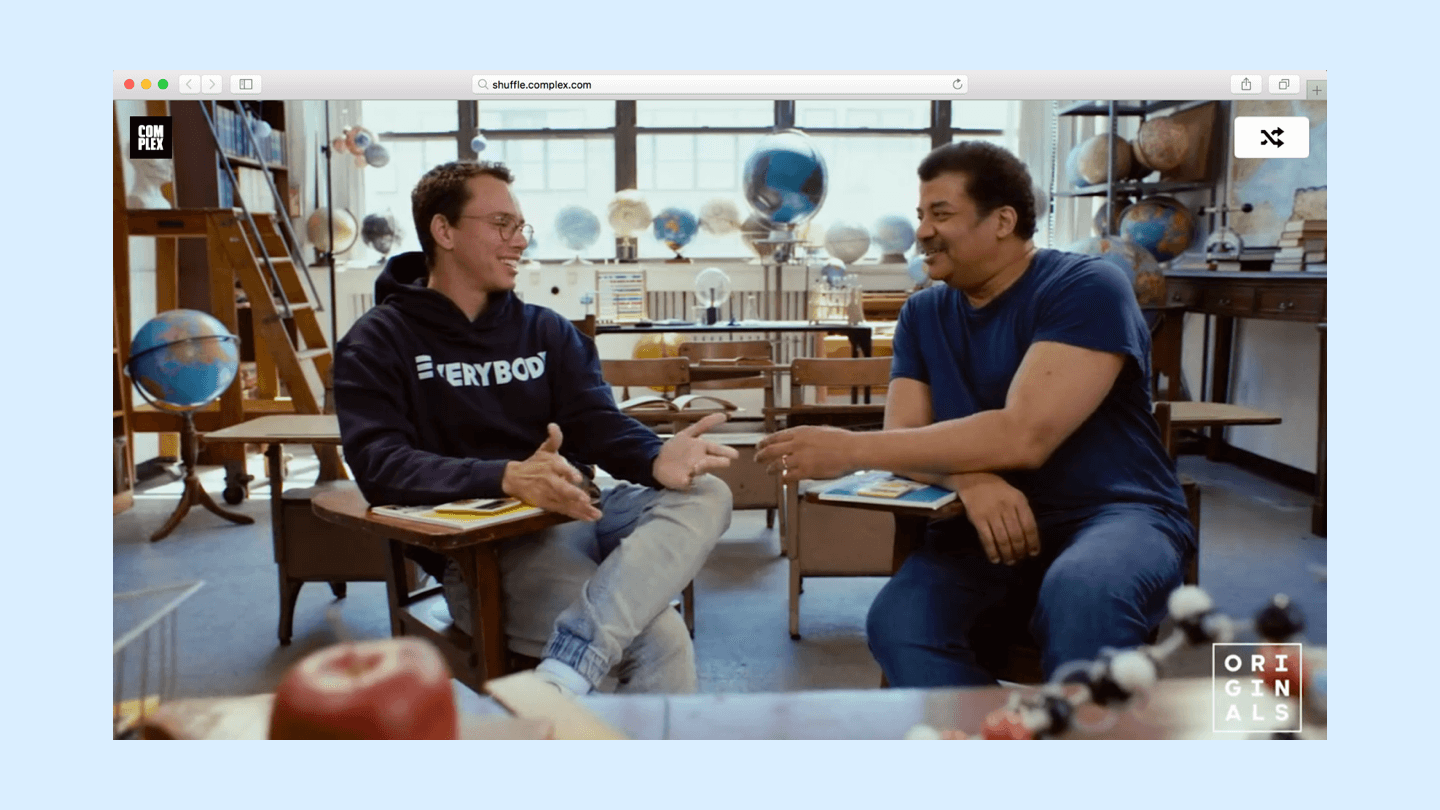
On load, the video controls and video title are shown.
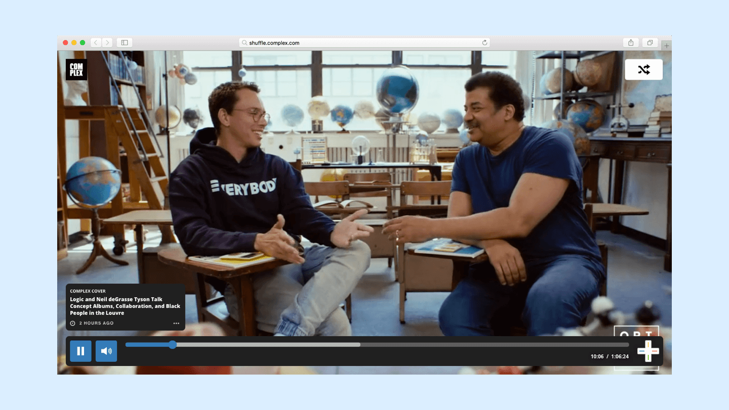
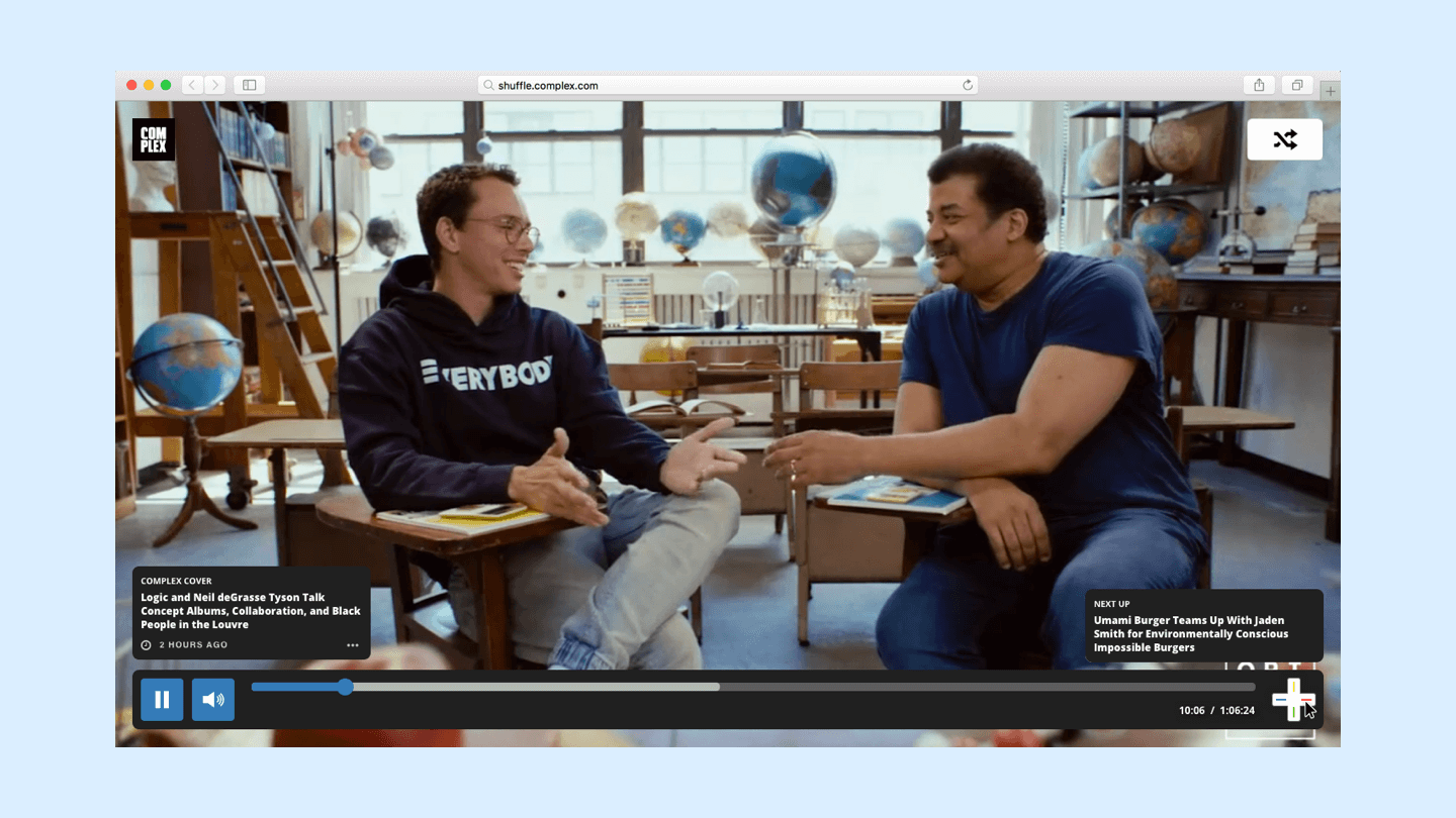
On hover over the directional control pad, “Next Up”, “Next Channel”, “Previous”, and “Previous Channel” titles are revealed.
On hover over the channel logo, the full show archive is revealed.
You can check out the current iteration of Shuffle. Or read more about the technology and frameworks used to build it.